We've made some changes and have had a bit more progress in the living room since the last time I showed you. I still consider this room very much a work in progress as I have tons of ideas still to come, but I'm pretty pleased with how things are falling into place.
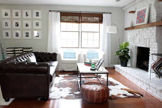
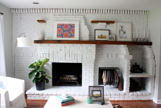
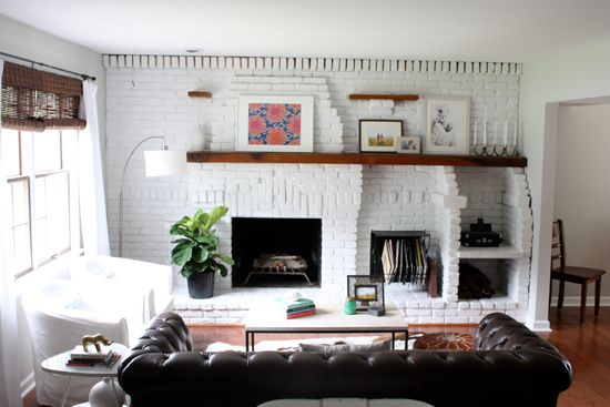
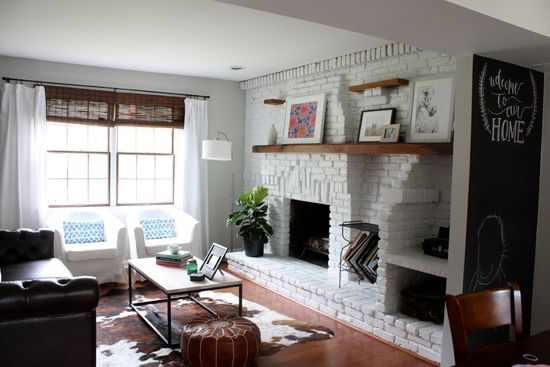
First things first, I needed to freshen up the mantle. I just wasn't happy with the brown mirror we had up there. To me it made the space feel too dark, so I took one of the framed napkins that used to hang above the couch in our townhouse and propped it up on the mantle for a light, brighter pop of color. These framed napkins are still one of my favorite, and easiest DIY projects. You can see I have only one of them up there. Did you catch the second one in this sneak peek? Is it bad decor manners to have the same piece of art in two places in your home? I don't think so, especially when one of the places is rarely seen by guests.
I also needed some greens in the living room and picked up a great leafy friend from Home Depot. He still needs a proper planter, but I'm waiting to make sure I can keep him alive before spending some serious dough on one.
Speaking of, does anyone know what kind of plant that is? It didn't come with a tag and I'm struggling a bit to keep it alive. I've already lost a few large leaves.
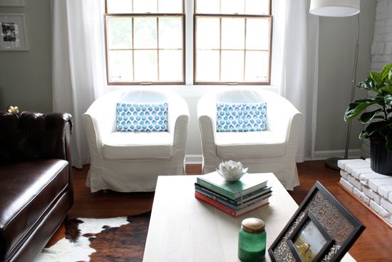
We purchased two ikea Ektorp Tullsta chairs to add some seating to the room. Definitely fills out the space better and makes it feel a bit cozier. The 'pillows' on the chairs are actually old Anthropologie napkins wrapped around the pillows that came with the chair. I was using them as sort of a test run to see if I liked pattern pillows on the chairs before purchasing any.
I went back and forth between a number of pillow covers I saw on Etsy. I narrowed it down to two options, photoshopped into the living room below. Ignore the color quality of the below photoshopped options, they are both from a photo I took on my phone and make the space look darker and the fireplace look beige, not white.
Option 1. I love this pillow cover from Loubella1 and probably would have purchased it if I hadn't done a photoshop test run first. While I like the blue it seems too dark with the amount of dark brown in the blinds, couch and rug.
Option 2 was the winner for me. The pillows below from chicdecorpillows have hints of blue to tie in with the framed napkin on the mantle, yet are still light enough on the chairs not to make that space feel too dark and heavy with the rest of the room. Once I actually have the pillows I'll take fresh photos to show. In the meantime you can enjoy my choppy photoshopped version.
I also purchased this pillow cover from The Mod Boho, my new favorite online textile shop. I'm so in love with it that I'm saving up to purchase more! The pillow cover just arrived yesterday so I didn't have it on time for these photos, but picture that thrown into the mix. Possibly on the couch with a few more boho pieces. I'm loving the latest Indigo home decor trend and need to add some into the house asap.
Another addition to the room is a brown leather morroccan pouf on the other side of the coffee table. We toyed with the idea of having each of the chairs on either side of the coffee table, but didn't like the idea of having someone's back face the kitchen when we entertain. Seems somewhat counter productive to the open floor plan of the living room/kitchen space. We opted for a lower alternative with the pouf to balance out the other side of the coffee table opposite the chairs, and also provide an optional seat or foot rest without closing the seating space off to the kitchen.
Below you can see how the kitchen opens up into the living room. (Also a peek at the new chalkboard wall!)
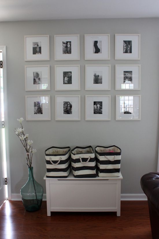
I filled out the frames on the gallery wall by the front door using all black and white family photos. I love the idea of being able to change them out every few months with fresh ones, especially when the kids keep growing so quickly. This wall has proven to be a a great piece for guests to look at when they visit.
The striped baskets on Lucy's toy box are a temporary placement. I purchased them from the Container Store to store Lucy's toys that don't fit in her toy box (ahh the perks of having a birthday party - more toys!). They are a bit big and cluttery to keep on top of the toy box and I have plans to move them elsewhere.
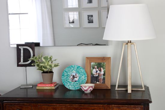
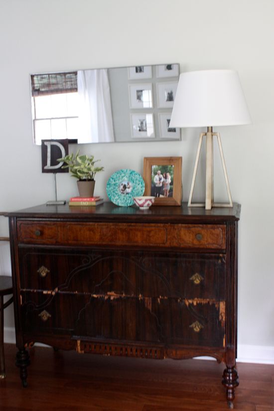
I rearranged the antique dresser a bit and added some family photos (we finally have a few of all 4 of us!) as well as a plant to bring a little green to that side of the room.
While I adore this dresser it just doesn't fit in our living room the way I had originally hoped it would. It's a bit bulky and seems somewhat out of place as the first thing people see when they walk in our front door.
I'm currently on the hunt for a new console table to take it's place, preferably one with a bottom shelf to house the striped baskets with Lucy's toys that I mentioned above. I have a few I'm considering, but I think this post has rambled on long enough, I'll save those for another post next week.
Happy Friday!




No comments:
Post a Comment