When we moved into our house, we were very fortunate that it was "move in ready." The previous owner used the house as a rental property and when he decided it was time to sell, he gutted and renovated the whole house - kitchen, floors, bathroom, knocked down walls, new roof, and more.
While everything looked great, there were still a few things that weren't quite our taste, specifically the light fixtures on the first floor. Between the kitchen, hallway and laundry room, we had 6 light fixtures that just didn't quite flow together. Two pendant lights with oil rubbed bronze metal, two boob lights (different metals), and two semi-flush mounts that were nice builder grade, but they didn't match the rest of the fixtures in the kitchen.
After a few weeks of research I selected 4 new fixtures in white and chrome to replace the lights we didn't like. I bought two of the flush mount and two of the globes for a total of 6 fixtures.
Top Left: West Elm Simple Drum Shade
(note: must purchase conversion kit and cord set separately)
Top Right: Pottery Barn Classic Pendant
Bottom Left: West Elm Globe Pendant
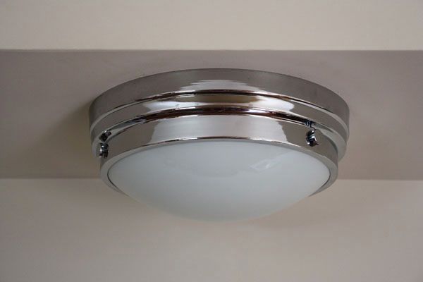
Bottom Right: Home Depot Minka Flush Mount in Chrome
(bonus: looks identical to the Pottery Barn Audrey flush but half the price!)
Jordan and my father-in-law were able to swap all the light fixtures one night last week and I couldn't be happier with the results. I figure the best way to show you the difference is to share a little before and after comparison.
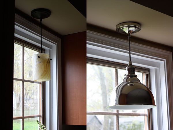
First the old pendant light above the kitchen table. This was probably my least favorite light fixture, plus I hated the yellow glow the shade gave off when the light was on at night.
Replaced by the simple drum shade from West Elm:
I toyed with the idea of a more rustic, metal statement light fixture (you may have seen on my Instagram), but in the end settled in this simple replacement. I think it makes more of a statement and pops against the dark wood of the kitchen set. Note: we still have plans to paint the kitchen once we get a little more settled with the baby. The plan is to use the same paint color we used in the girls' rooms - Benjamin Moore 'Moonshine'.
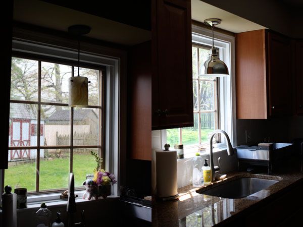
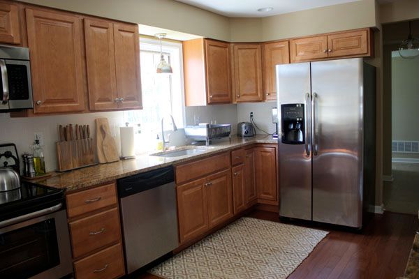
Above the sink was another pendant light that matched the one above the table. I chose this classic chrome pendant from Pottery Barn to replace it. I'm still giddy that we finally have a window in our kitchen. That was one thing I always wished we had in our townhouse. I'm a lover of natural light.
Sorry for the poor quality of photos, I can't quite get the hang of taking photos of windows without the rest of the picture looking dark.
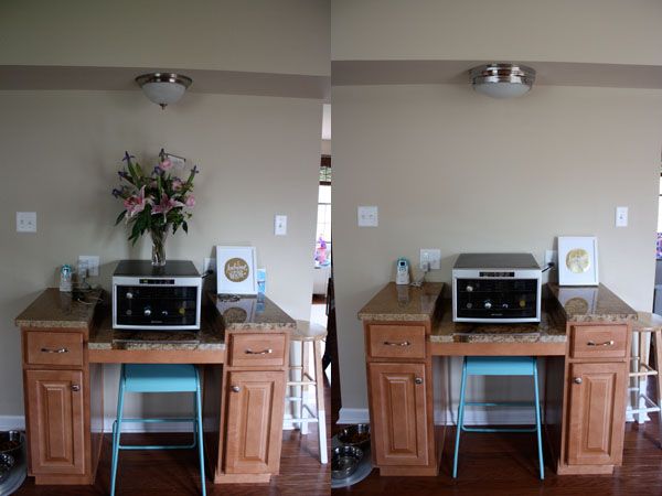
We also had one of the infamous ugly 'boob lights' in our kitchen above the desk area.
I didn't want to get too crazy and buy half a dozen statement light fixtures so I selected this classic looking flush mount to replace the boob light above the desk as well as one of the semi-flush mounts above the pantry (you'll see in one of the photos below). As I mentioned above I originally fell for the Audrey flush mount form Pottery Barn, but at $149 a piece I couldn't justify spending $300 on 2 simple flush mounts. I was excited to find that almost identical option at Home Depot with the Minka Lavery for $89. Plus, Home Depot gave me the option of chrome or brushed nickel, whereas I only has the brushed nickel option at Pottery Barn.
A before and after comparison. Not a huge change, but I like the classic look of the Minka flush mount.
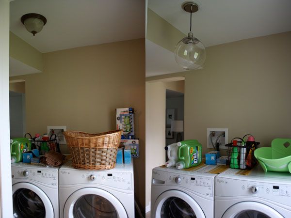
Another boob light was in our laundry room and I swapped that out for one of the globe pendants from West Elm. I love these globe lights and bought two of them a few months ago after our offer was accepted on this house. The lights were on sale and I knew I would find a great place for them. One of them now resides in the laundry room. Another room we have bigger plans for with regards to paint (I'm thinking a navy accent wall behind the washer and dryer) and some storage/shelving down the road.
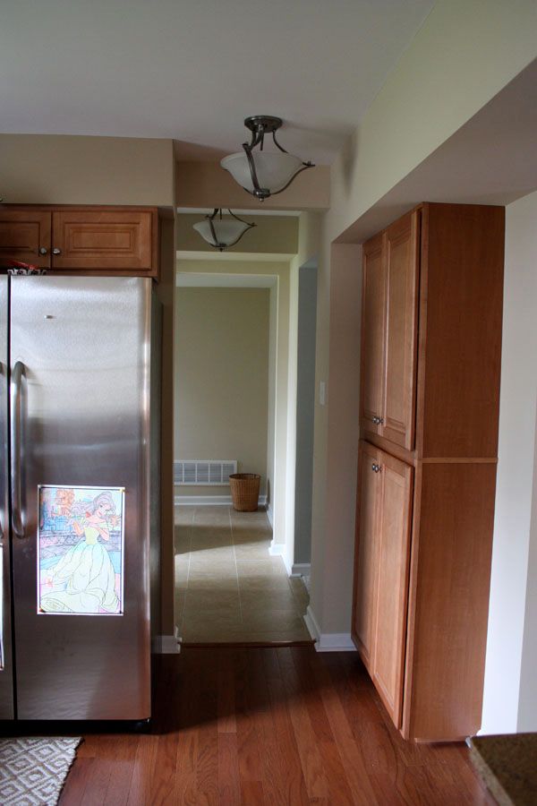
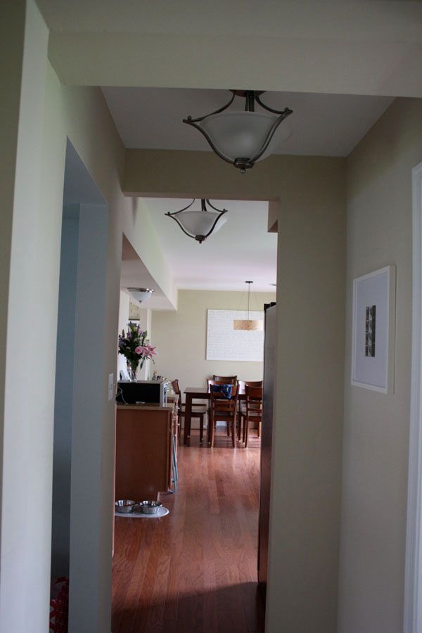
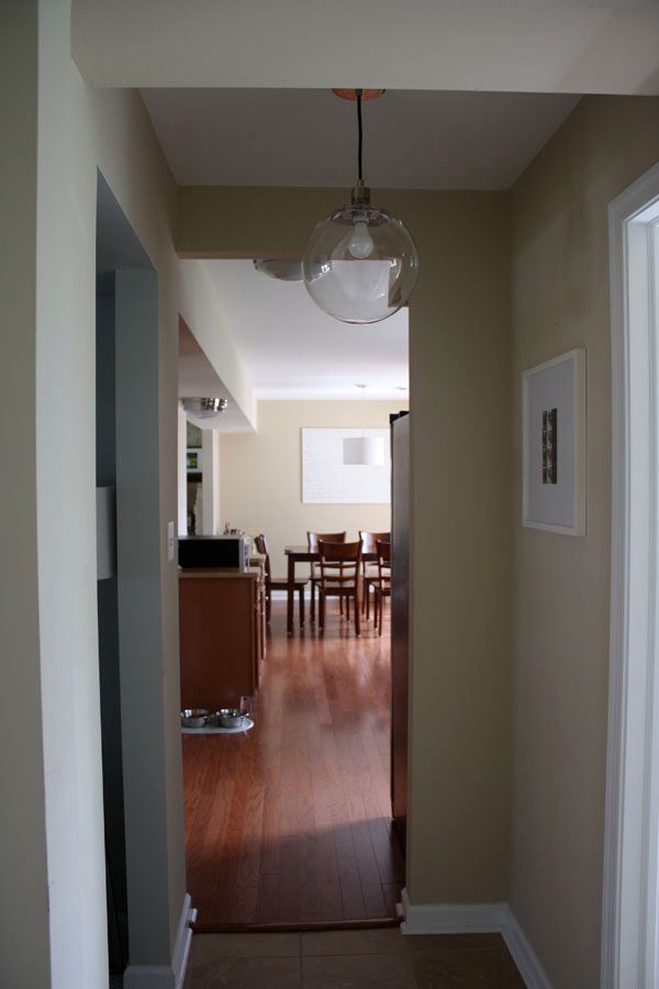
The other globe light replaced the second semi-flush mount that was in the hallway outside the powder room.
A view from the kitchen down the hall with the light fixtures before,
and how they look now.
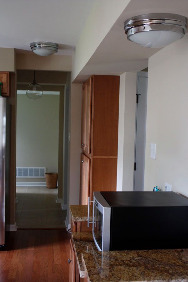
Another view of the same light fixtures, this time from the laundry room facing the kitchen. You can see the two semi-flush mounts, the boob light and the old kitchen table pendant.
And after with the new fixtures. I love how nicely the chrome flows together, especially with how open our layout is downstairs. It was very important that all the light fixtures flowed well together.
We plan to purchase some clear bulbs to replace the ones currently in the globe lights, but for now we are satisfied with the look of the lights.
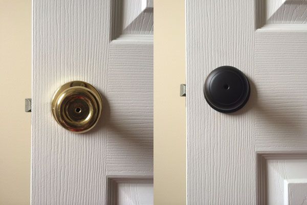
As a bonus, a quick peek at another project I tackled our second day in the house. :) I was in a crazy nesting stage of pregnancy. I replaced all the door knobs and hinges throughout the house from these old brass knobs, to these clean oil rubbed bronze ones. I bought all the new knobs and hinges from Amazon and spent just about $200 for 25 hinges and 11 knobs.
It took my slow pregnant butt almost a full day to replace all the knobs and hinges, but once I finished our entire house had an instant upgraded look.
Between the door knobs and light fixtures our new house instantly feels more 'us'. Both changes make a huge difference in not only how the house looks, but how it feels. I'm itching to get some paint on the walls downstairs and can't wait to show some better photos of the house once we do.
What was one project you couldn't wait to tackle after moving into your house?





um, my hubby and i want to replace our gold knobs. these are fantastic! do you remember exactly which knobs they were on amazon?
ReplyDeleteAmazon has them for a great price. I bought Kwikset brand. http://www.amazon.com/gp/aw/d/B003SQSUHI/ref=mp_s_a_1_1?qid=1399596006&sr=8-1&pi=SY200_QL40
Delete